Great Examples of Nonprofit Infographics from 2023
In 2023, the power of visual data has never been more apparent. As we navigate an increasingly complex world, infographics have emerged as a vital tool for simplifying intricate information, making it accessible and engaging for a global audience.
These visual representations blend data and design to tell stories, highlight trends, and share knowledge in a way that's intuitive and immediate. From environmental concerns to technological advancements, infographics break down barriers to understanding, allowing everyone to grasp significant issues and insights at a glance.
What Makes an Effective Infographic
An effective infographic does more than just catch the eye; it enlightens and informs. Here are the key elements that distinguish a truly impactful infographic:
Clarity: It delivers a clear message without overwhelming the viewer with too much information.
Relevance: The data presented is up-to-date and pertinent to the target audience's interests or needs.
Accuracy: Information is researched and correctly cited, building trust with the audience.
Engagement: Creative design elements and a narrative draw the viewer in and encourage them to explore the whole infographic.
Accessibility: Information is presented in a way that's easy to understand, regardless of the viewer's prior knowledge of the subject.
Visual Appeal: Aesthetically pleasing design and colour schemes make the infographic not just informative but also enjoyable to look at.
Shareability: The infographic is easy to share on social media and other platforms, extending its reach and impact.
The Great Examples
Domestic Violence Facts and Statistics At A Glance
This infographic template from Venngage captures the gravity of domestic violence in the U.S. with clarity. Its strength lies in presenting alarming statistics—like 1 in 5 women experiencing domestic sexual violence—against a stark purple backdrop, a color symbolic of Domestic Violence Awareness.
The graphic educates on the various forms of abuse within an intimate relationship, from physical to economic, and balances gender-related data with impactful visuals, such as the contrasting figures of male-to-female abuse victims.
Notably, it includes a call to action, providing resources for those affected, which emphasises the infographic's purpose: not just to inform, but to serve as a lifeline for individuals in need.
Climate Change and Its Impact on Canada’s Environment
This vibrant infographic delivers a clear and educational snapshot of climate change impacts on Canada and the broader environment.
It uses a mix of visuals and text to convey key points like the 16% increase in precipitation in Canada, the alarming warming rates in the Arctic, and the broader consequences such as melting glaciers and ocean acidification.
The design smartly incorporates thematic icons and a colour palette that reflects the cold-to-warm spectrum, symbolising the heating effect of climate change.
Lastly, it also effectively highlights the interconnectedness of various phenomena, from greenhouse gas emissions to the stratification of ocean layers and their collective impact on marine life, illustrating the multi-faceted nature of environmental changes.
5 Ways To Celebrate International Volunteer Day
This infographic effectively celebrates International Volunteer Day on December 5th by illustrating the significant impact of American volunteers.
It creatively uses vibrant colours and playful icons that match the activities they represent, like books for literacy and a soup bowl for food services. Sharp contrasts and bold figures draw attention to key statistics, such as the impressive 7.9 billion hours of service contributed by American volunteers.
The infographic goes further to suggest practical ways to participate in volunteering, from food services to mentoring youth, capturing the spirit of community service in an accessible, visually engaging format.
Poverty, Hunger, and Jobs: Pandemic Update and Recovery Prospects
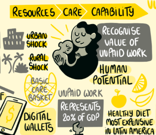
This detailed infographic from the Chronic Poverty Network serves as a visual thinkpiece on the relationships between poverty, hunger, and employment.
Illustrated with engaging sketches that convey the urgency and humanity behind the data, the graphic uses a mix of casual handwriting and bold lettering to highlight key points.
Key figures presented include the alarming disparity in digital wallet access, representing a shift in market dynamics, and the recognition of unpaid work, which notably accounts for 20% of GDP.
Lastly, the use of directional arrows and interconnected topics, illustrated through a lively mix of colours and shapes, guides the viewer through the complexities of recovery and vulnerability in a post-pandemic world.
This infographic not only informs but also stimulates deeper reflection on the issues at hand creating a narrative that encourages viewers to consider the broader implications of economic and social recovery efforts.
Newcastle NE1’s Accomplishments
We hope you'll forgive a little self-congratulation as we toot our own horn for Leon! Animations' recent project with Newcastle NE1, where we brought their impressive accomplishments to life through a vivid infographic.
This is an infographic that is visually striking as it is informative, with bold blocks of NE1's signature blue setting a dynamic backdrop for the array of achievements.
The layout cleverly mimics cityscapes, with clean lines and stylised icons that represent litter collection, funding milestones, and visitor statistics. It's a bustling grid of success stories, mirroring the vibrant energy of Newcastle itself.
Capturing the essence of NE1's transformative impact since 2019, the graphic boasts compelling statistics like the £41 million in funding secured for the city and the 5,000 bags of litter removed annually by their Clean Team.
Our design highlights NE1's commitment to revitalising the Bigg Market, the successful draw of events pulling in 347,000 attendees, and the significant online engagement they've fostered, represented by 640,000 website visitors and a growing social media following.
This infographic is a visual testament to NE1's transformative impact on Newcastle, backed by an animated video that complements its narrative. Together, they tell a cohesive story of community uplift and positive change.
The Massive Impact of Cigarette Filters on Our Oceans
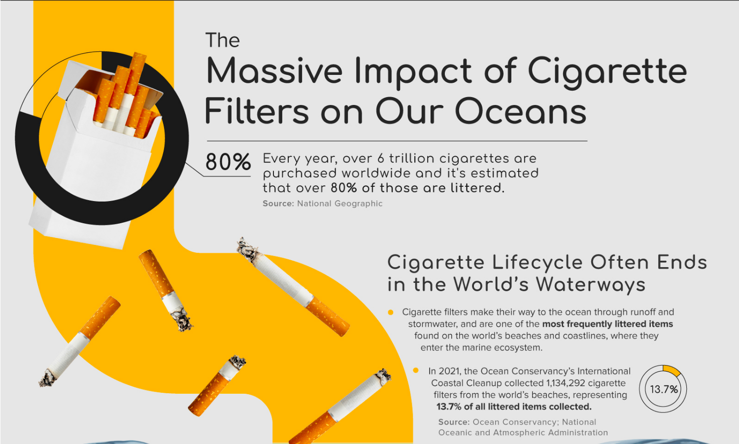
This infographic, created by Visual Capitalist and featuring Greenbutts, commands attention with a bold, colour-blocked design that graphically narrates the journey of cigarette filters from urban litter to dangerous ocean pollutants.
Vivid illustrations and a sharp contrast between the bright colours and the stark, monochromatic images of affected marine life drive home the sobering message: cigarette filters, composed of cellulose acetate, are a significant contributor to oceanic microplastic pollution.
The narrative flows seamlessly, anchored by clear, concise data points that expose the overwhelming scale of the issue, such as the 6 trillion cigarettes purchased yearly and the long decomposition period of these filters.
The infographic doesn't just highlight problems; it also provides a solution, showcasing Greenbutts' initiative to combat this pollution with biodegradable filters. It's an educational journey that begins with hard facts and ends with hope, visually encapsulating both the grave impact of human habits on marine ecosystems and the innovative steps being taken towards a sustainable future.
Conclusion: The Impact of Infographics on Information Sharing
Infographics have revolutionised the way we share and consume information. By transforming complex data into visually engaging narratives, they play a crucial role in educating the public, influencing opinion, and sparking conversation.
Furthermore, they are a cost-effective solution that aligns perfectly with the strategies outlined in our "Making a Nonprofit Video on a Budget" blog, which presents infographics as a substitute for costlier options like animation.
This year, we've seen everything from stark representations of environmental crises, such as the impact of cigarette filters on oceans, to the mobilisation efforts of nonprofit organisations, capturing their achievements with bold colours and sharp statistics.
The ability to distil vast amounts of data into a single, compelling visual makes infographics an indispensable tool in the digital age, especially in 2023, as we face a lot of information daily.
Their impact extends across various fields, from journalism and education to marketing and advocacy, demonstrating the universal appeal and effectiveness of well-crafted visual data.
Do you think we've overlooked any standout nonprofit infographics from 2023? If you've encountered infographic gems that we missed, we'd love to see them. Please email us with these discoveries and contribute to our expanding showcase of exceptional visual storytelling.


